 After a casual search I found almost nothing on what has become one of my most effective PS adjustments - the Selective Color adjustment layer. Now, if you Google "selective color photoshop" you'll find no shortage of tutorials on isolating a specific part of an image and altering its color; this is not one of those.
I'd say the first reason people don't touch this adjustment is that Abode has seen fit to lable its innards in an shockingly counter-intuitive fashoin: Cyan, Magenta, Yellow, Black. By case, you may know these 4 (cmyk) - throw backs from when their mastery was essential to printing. Back then "black" was "key", i.e. our "k"; however, for this, think of the black as your "lightness" slider in Lightroom.
I labled the other 3 as "shockingly counter-intuitive" because the slider also function as the light color wheel and thus:
Cyan<->Red
Magenta<->Green
 Yellow<->Blue
Flip that around and...
Red<->Cyan
Green<->Magenta
Blue<->Yellow
Which, this is exactly what the left side of the sliders do versus the right side and something slightly closer to the RGB space we're used to (although, still not actually RGB as we know it). Had they so been labled, I feel people would much more naturally gravitate towards and experiment with this adjustment.
Next, pulling down the "Colors" tab reveals the areas you can adjust - these two are framed around the light color wheel: red, yellow, green, cyan, blue, magenta.
While it works, the ultimate bizzareness is simply that the image you're working on, as well as Photoshop itself, does not work around the light color wheel, but instead that of standard RGB (red, magenta, blue, cyan, green, yellow). For the rest of what I'll cover however, none of this matters, just understand what the adjustment layer will do and experiment on your own.
The selections in the "Colors" tab represent what areas will be affected and it is more-or-less 100% intuitive. But to see what will be touched, merely grab the Black slider and fling it around. This will show you the areas of affect.
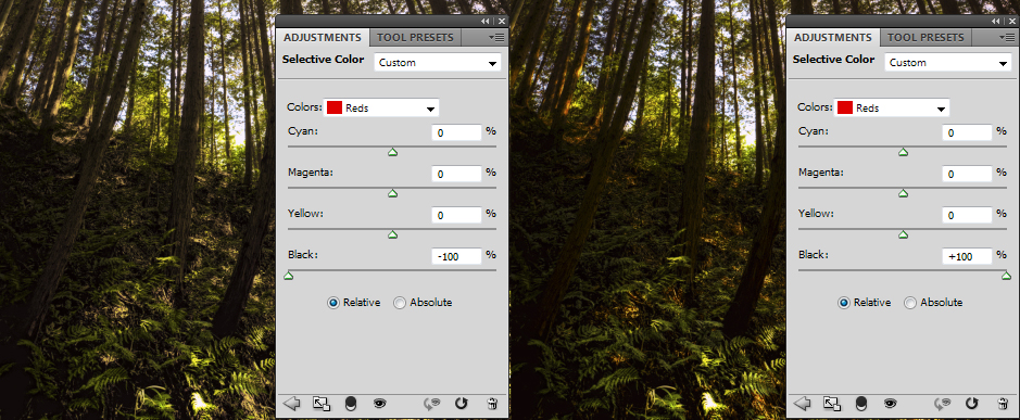
In this example, we see the Reds will affect the trees and dirt. For the image those will work better with a touch more Red and I want a warmer look overall, so I'll continue through the Colors testing which areas I want to touch up by testing it with Black slider first and then matching that area to my overall objective - a warm summer day lost in the woods.
I find this process allows me to selectively tone and hue a color region warming, cooling, or just enriching it in a way that Hue/Saturation, Vibrance, etc cannot.
Additionally, you also have Whites, Neutrals, Blacks in the Color selection. Which, how you adjust Black in the Blacks is certainly a naming folly; but again, think of it as Lightness from Lightroom and it will make sense... well enough anyway. For reference these work as follows:
Whites - This touches just the white areas - not the highlights. Don't think of these 3 in that way (althought it is similar).
Nuetrals - Aside from your deepest shadows and starkest whites, everything is neutral. Again, this isn't a "midtone".
Blacks - This has the most dramatic impact. It will touch almost everything that isn't starkly white.
So, in terms of scale of influece, Whites = a little, Neutrals = a bit, and Blacks = a lot. For me, that's always made the most sense.
To the image!
As I said, I wanted a warm summer day so I went the the following:
Reds: cyan -52, magenta 0, yellow 0, black +7
Thus, deeper, warmer yet darker red (can't think of any other way to get warmer yet darker!)
Yellows: cyan +9, magenta 0, yellow +8, black 0
I wanted warmer right? Why add cyan? Simple, yellow strongly affects vegitation - a little cyan back into those regions will create a strong contrast between my warm tree trunks and rich, cool vegitation. Even in the summer, a thick forest floor is nice and cool.
Green, Cyan, Magenta, Blue: no touch.
You may look at the blue in the sky and wonder why I didn't use the Cyan or Blue sliders. Actually, that sky was stark white. This isn't an HDR; but I manage to fake it to a degree and "recover" the sky. How?
Whites: cyan +100, magenta 0, yellow -100, black 0
Ah! I made my stark white sky sky-colored!

Neutrals: cyan -5, magenta 0, yellow +5, black 0
Nice simple overall warming cast.
Blacks: cyan -1, magenta 0, yellow 0, black 0
Remember, massive impact. Use with extreme caution. I almost never go beyond +/-3 and almost always stay around +/-1.
And done! Warm, seemingly proper sky, cool forest floor...

And personally, I think my Notre Dame shot is the best example I've produced of how this works.

Controlling the warming, cooling, and toning all uniquely through the Selective Color adjustment layer created a more welcoming, richer scene.
Follow me on,
Google+: https://plus.google.com/
Smugmug: http://jasonarney.smugmug.com/
500px: http://500px.com/jasonarney
Flickr: http://www.flickr.com/photos/jasonarney/
Facebook: https://www.facebook.com/jason.arney